Widget Content Syntax
Appendix reference for the content formats used inside interactive widgets.
Every interactive widget in the Lex Editor has a content format that defines its data -- pairs, items, statements, or text. When you insert a widget through the toolbar or slash commands, the editor wraps this content automatically. You do not need to write the wrapper by hand -- but understanding the content format is useful for advanced users, AI prompt engineering, and troubleshooting.
Who this is for
Advanced users who need the exact content formats used inside widgets.
What this page answers
- what the editable content looks like inside each widget
- how inline widgets differ from standalone widgets
- which syntax details matter for troubleshooting or AI prompts
This page documents the user-editable content of each widget type. Settings like shuffle, visual style, grid size, and instruction text are configured through the widget's edit panel (toggle Edit mode with the eye icon in the toolbar). The "Editable" column in each settings table indicates which parameters can be changed directly in the editor.
Inline answer widgets show a teal outline when selected — either by clicking, dragging across them with the cursor, or using Cmd/Ctrl+A. This makes copy, cut, and delete operations easier to target inside long paragraphs.
In-text Widgets
In-text widgets sit within a line of text. Their syntax is written directly inline.
Fill-in-the-Blank (AnswerInput)
Format: ___(correct_answer) or ___(correct_answer)<<comment>>
The simplest inline widget. Place it anywhere in a sentence where you want a text input field.
Basic Usage
She ___(went) to the store yesterday.Multiple Accepted Answers
Separate alternatives with a pipe |:
She ___(went|visited) the museum.With Hint
Add a hint after the answer using the :: separator inside the parentheses:
She ___(went::to go) to the store.The hint (here, the base form to go) renders in bold teal next to the input as a persistent clue. Hints round-trip through the editor and Markdown export, so you can copy answers between lessons without losing them.
Older lessons written without :: still work — the hint is simply absent.
With Student-Facing Comment
Add an optional comment after the answer when you want to explain why the answer is correct:
She ___(went::past of go)<<Use the past simple after yesterday.>> to the store.You can type `<<Your explanation>>` character-by-character directly after an existing gap (___(...)), and as soon as you type the closing >>, the comment is automatically attached to that answer widget and the typed syntax disappears into the widget's answer comment.
The comment appears in the answer results panel after the student answers correctly or after three tries (or the reveal limit). Teachers can also open the panel while editing and update the answer, hint, or comment without rewriting the sentence.

How It Is Detected
If the content inside ___() has no comma, it is recognized as an answer field (fill-in-the-blank). If it has commas, it becomes a dropdown answer.

Multiple Choice Dropdown (AnswerCombo)
Format: ___(correct;wrong1;wrong2) or ___(correct, wrong1, wrong2) or ___(correct;wrong)<<comment>>
An inline dropdown where the student selects from options. You can separate options with semicolons (;) or commas (,).
Basic Usage
Yesterday, I ___(went;go;going;gone) to the store.The first item is always the correct answer. Items after semicolons or commas are distractors. The display order is shuffled automatically.
Multiple Correct Answers
Use a pipe | for alternatives:
___(went|visited;go;going) to the store.With Hint
___(went::to go;go;going;gone)The ::hint attaches to the correct answer and is displayed beside the dropdown after submission.
With Student-Facing Comment
___(went::to go;go;going;gone)<<Use the past simple for a finished action yesterday.>>Comments can be combined with hints, alternatives, and distractors — for example:
___(big|large;small::size)<<Big and large mean the same thing.>>You can type `<<Your explanation>>` character-by-character directly after an existing dropdown widget (___(a;b)), and as soon as you type the closing >>, the comment is automatically attached to the dropdown and the typed syntax disappears into the widget's answer comment.
Students see the comment in the results panel after a correct answer or after three tries (or the reveal limit). Teachers can hover or click the answer to keep the panel open, edit the correct answer, edit distractors, change the hint, change the comment, or reset attempts.
Automatic Distractor Deduplication
If a distractor accidentally repeats the correct answer or another distractor (a common slip in AI-generated drafts like ___(went, went, go)), the editor silently removes duplicates on save, insert, and paste. Comparisons are case-insensitive.

Teacher Results Panel
Fill-in-the-blank, dropdown, and inline choice answers use a shared results panel:
- Students see it only after the answer is revealed.
- Teachers can inspect answers while editing, then click the panel to keep it open.
- Edit lets teachers adjust the correct answer, dropdown distractors, hints, and comments.
- Reset clears attempts so the revised question starts fresh for collaborators.
- In exam lockdown, answer panels are hidden until the exam rules allow reveal.
Dismiss the panel by clicking outside it, pressing Escape, or saving/canceling an edit.
Inline Choice (AnswerChoose)
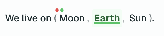
Format: [correct;wrong1;wrong2] or [correct, wrong1, wrong2]
An inline widget where all options are shown as clickable text. Unlike the dropdown, every option is visible at once — the student clicks to choose. Uses square brackets instead of ___(). Options can be separated with semicolons (;) or commas (,).
Basic Usage
Yesterday, I [went;go;going;gone] to the store.The first item is always the correct answer. Items after semicolons or commas are distractors. The display order is shuffled automatically. The widget renders inline as (went, go, going, gone) — click an option to select it.
Multiple Correct Answers & Comments
Use a pipe | for alternatives, and attach an optional comment using `<<comment>>`:
[big|large;small]<<Big and large mean the same thing.>>You can type `<<Your explanation>>` character-by-character directly after an existing inline choice widget ([a;b]), and as soon as you type the closing >>, the comment is automatically attached and the typed characters disappear into the answer comment.
When to Use Instead of Dropdown
- When you want all options immediately visible (no click to open)
- When the options are short enough to fit inline
- For quick recognition exercises where seeing all choices at once aids learning
Standalone Widgets
Standalone widgets are inserted via slash commands or the Insert menu. Below is the content format for each -- what you edit inside the widget.
Matching Widget
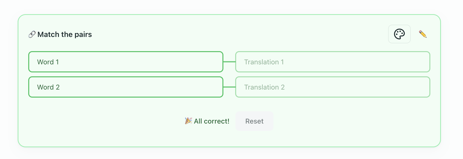
A click-to-connect pairing exercise.
Content Format
Each line defines a pair with left :: right. Distractors use the !! prefix:
- apple :: яблоко
- cat :: кот
- house :: дом
- car :: машина
- !! мышка
The !! item appears in the right column but has no matching left-side item.
A right-hand item can also be a picture. Pictures are shown in a square white frame with the text underneath as a caption, and the frame stays white in every theme so the picture reads the same way in dark mode. A pair whose right side is a picture with no text still scores normally.
Settings
| Parameter | Values | Default | Editable |
|---|---|---|---|
shuffle | true, false | true | Yes |
layout | rows, columns | rows | Yes |
ui | classic, children | classic | Yes (theme toggle) |
instruction | any string | (none) | Yes |
layout is named after the pairs, not the board, so the two values look backwards. rows — the default — puts the prompts and the answers in two side-by-side columns, and each pair reads across as a row. columns stacks the board instead: prompts along the top, answers along the bottom, and each pair connects vertically. Picking Columns in the settings form gives you the top-and-bottom board.
Ordering Widget
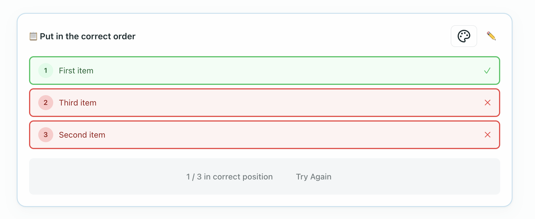
A drag-and-drop sequencing exercise.
Content Format
Items are listed in the correct order. The editor shuffles them for the student. Use for both sentence ordering and word ordering:
1. First, preheat the oven.
2. Then, mix the ingredients.
3. Next, pour into the pan.
4. Finally, bake for 30 minutes.
Settings
| Parameter | Values | Default | Editable |
|---|---|---|---|
instruction | any string | (none) | Yes |
ui | classic, children | classic | Yes (theme toggle) |
Items are always shuffled for the student.
Sentence Builder
Students drag word or phrase tiles to construct a target sentence.
Content Format
The first line is the target sentence. Each word becomes a tile in a shuffled bank. To create a multi-word phrase tile (keeping words together on a single movable chip), wrap the phrase in square brackets [like this]. Lines starting with !! add distractor tiles:
The cat [sat on] the mat
!! dog
!! [under the]
In this example, sat on and under the appear as single multi-word tiles in the student's word bank.
Settings
| Parameter | Values | Default | Editable |
|---|---|---|---|
instruction | any string | (none) | Yes |
hint | true, false | false | Yes |
ui | classic, children | classic | Yes (theme toggle) |
When hint is enabled, a hint button appears during gameplay that reveals one correct word in its correct position. Words and phrases are always shuffled.

True/False Widget
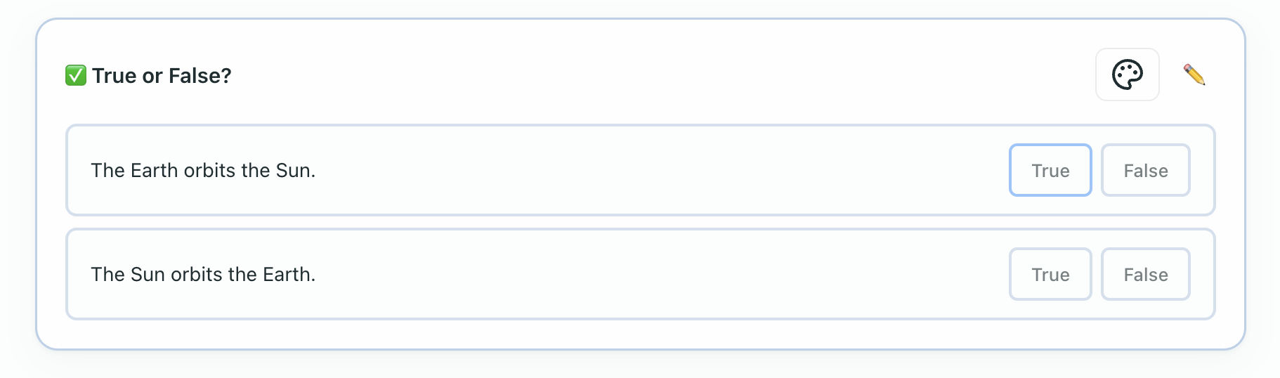
A series of statements to evaluate as true or false.
Content Format
[T] marks a true statement, [F] marks a false one. Text after // is the explanation shown after answering:
- [T] The Earth orbits the Sun. // It completes one orbit every 365.25 days.
- [F] The Moon is larger than the Earth. // The Moon's diameter is about 1/4 of Earth's.
- [T] Water boils at 100 degrees Celsius at sea level.
Settings
| Parameter | Values | Default |
|---|---|---|
instruction | any string | (none) |
ui | classic, children | classic |
Choose Answers Widget
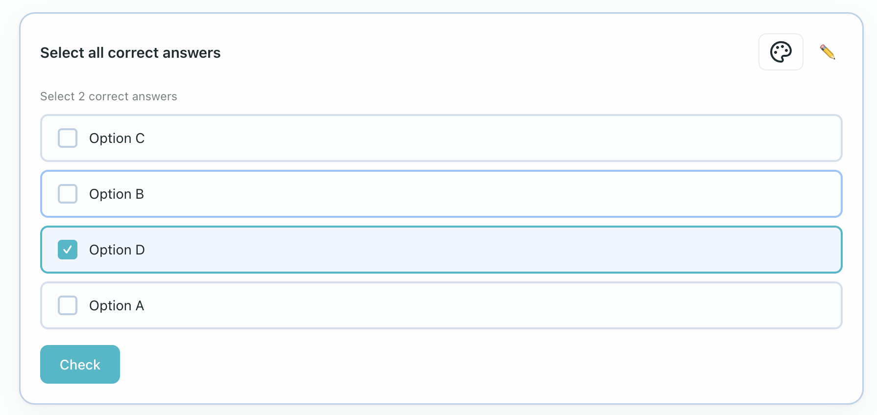
Students select all correct answers from a list of options (multi-select checkboxes).
Content Format
[+] marks a correct option, [-] marks an incorrect distractor:
[+] Apple
[+] Banana
[-] Car
[+] Cherry
[-] House
Settings
| Parameter | Values | Default | Editable |
|---|---|---|---|
instruction | any string | (none) | Yes |
shuffle | true, false | true | Yes |
show_count | true, false | true | Yes |
ui | classic, children | classic | Yes (theme toggle) |
When show_count is enabled, the widget displays "Select N correct answers" as a hint. Students can select at most N options — selecting a new one when at the limit automatically deselects the oldest selection.
Category Sort Widget
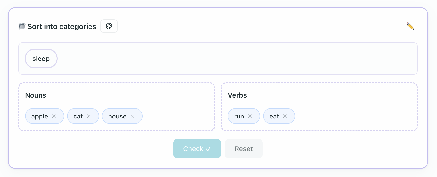
Students drag items into the correct categories.
Content Format
Categories are defined with ## Category Name, items listed below each:
## Nouns
- apple
- house
- cat

## Verbs
- run
- eat
- sleep
Items Valid in Multiple Categories
List the same item under more than one category when more than one answer should be accepted:
## Countable nouns
- cake
- chicken
- paper

## Uncountable nouns
- chicken
- paper
- water
Students place each item once. If an item appears in multiple categories, any listed category is marked correct. Scoring counts unique items, not every repeated category membership.
Settings
| Parameter | Values | Default | Editable |
|---|---|---|---|
layout | horizontal, vertical | horizontal | Yes |
instruction | any string | (none) | Yes |
ui | classic, children | classic | Yes (theme toggle) |
Feedback is always shown on submit.
Flashcard Widget
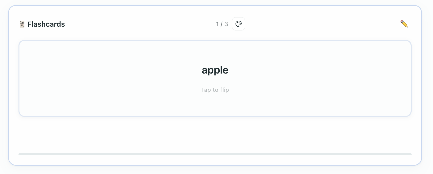
Interactive flip cards for vocabulary review.
Content Format
Each line defines a card: front | back. Optional hint in parentheses:
- apple | яблоко
- cat | кот
- house | дом (hint: place where you live)
Settings
| Parameter | Values | Default | Editable |
|---|---|---|---|
instruction | any string | (none) | Yes |
show_progress | true, false | true | Yes |
ui | classic, children | classic | Yes (theme toggle) |
Cards are always displayed in the defined order.
Memory Game Widget
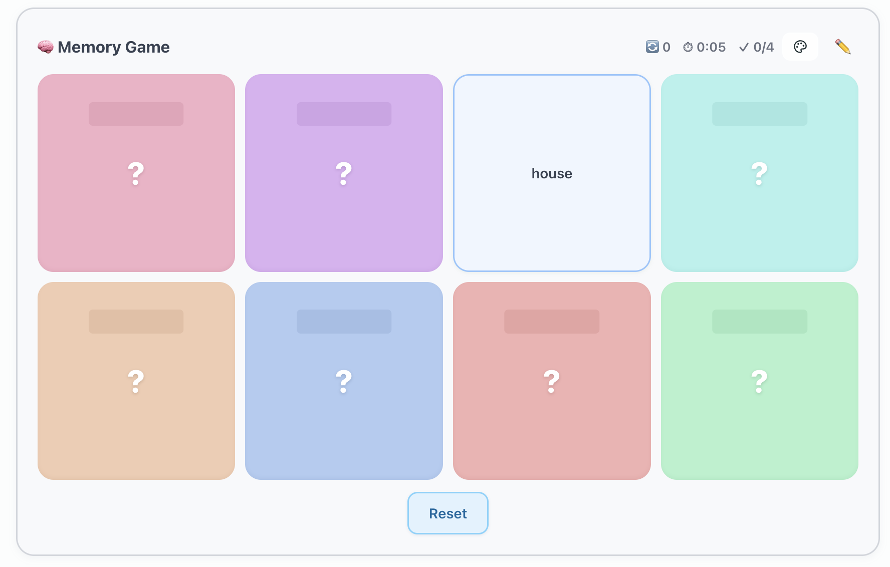
A classic memory matching game where students flip cards to find pairs.
Content Format
Each line defines a pair with term :: match:
- apple :: яблоко
- cat :: кот
- house :: дом
- dog :: собака
- book :: книга
- tree :: дерево
Settings
| Parameter | Values | Default | Editable |
|---|---|---|---|
grid | auto, 2x3, 2x4, 3x4, 4x4, 4x5 | auto | Yes |
instruction | any string | (none) | Yes |
time_limit | seconds | (none) | — |
show_timer | true, false | true | — |
ui | classic, children | classic | Yes (theme toggle) |
When a specific grid size is selected (not auto), the number of pairs must exactly match the grid capacity: 2x3 = 3 pairs, 2x4 = 4, 3x4 = 6, 4x4 = 8, 4x5 = 10. The editor validates this on save.
Word Scramble Widget
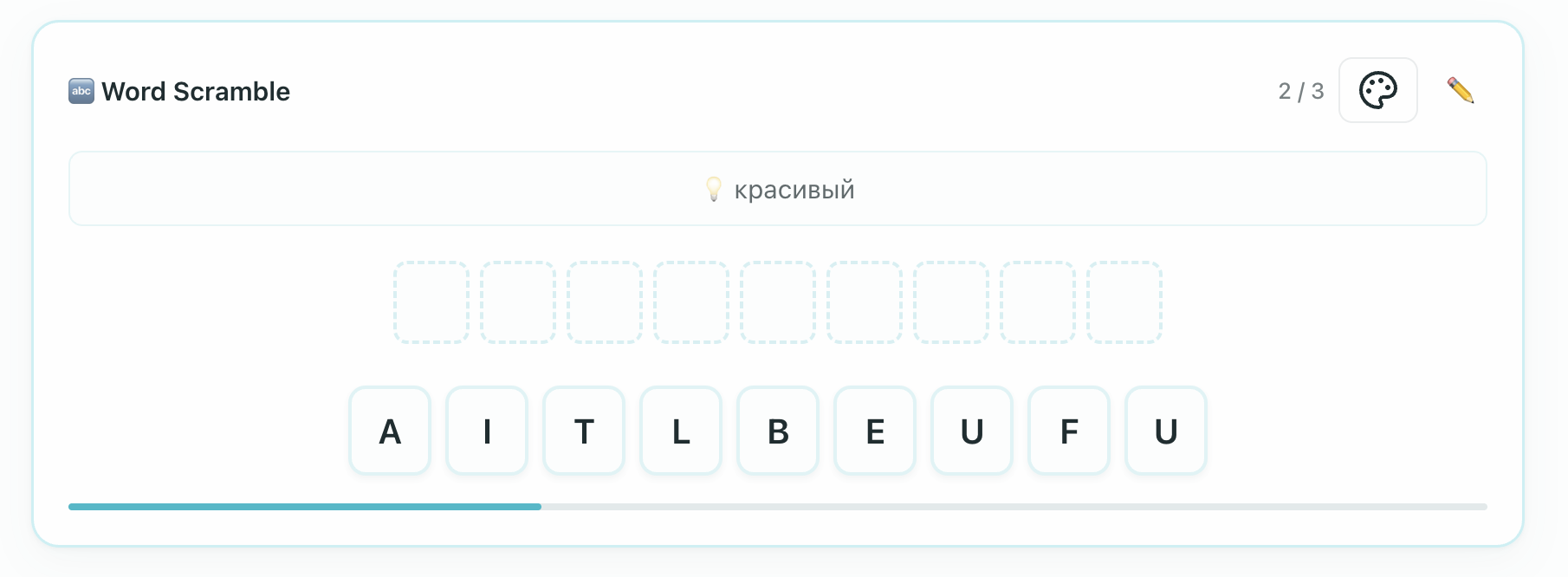
Students unscramble letters to spell the correct word.
Content Format
Each line: word (hint):
- apple (яблоко)
- beautiful (красивый)
- elephant (слон)
Settings
| Parameter | Values | Default | Editable |
|---|---|---|---|
hint_type | translation, definition, first-letter, none | translation | Yes |
instruction | any string | (none) | Yes |
attempts | number (1-10) | 3 | Yes |
ui | classic, children | classic | Yes (theme toggle) |
Word Search Widget
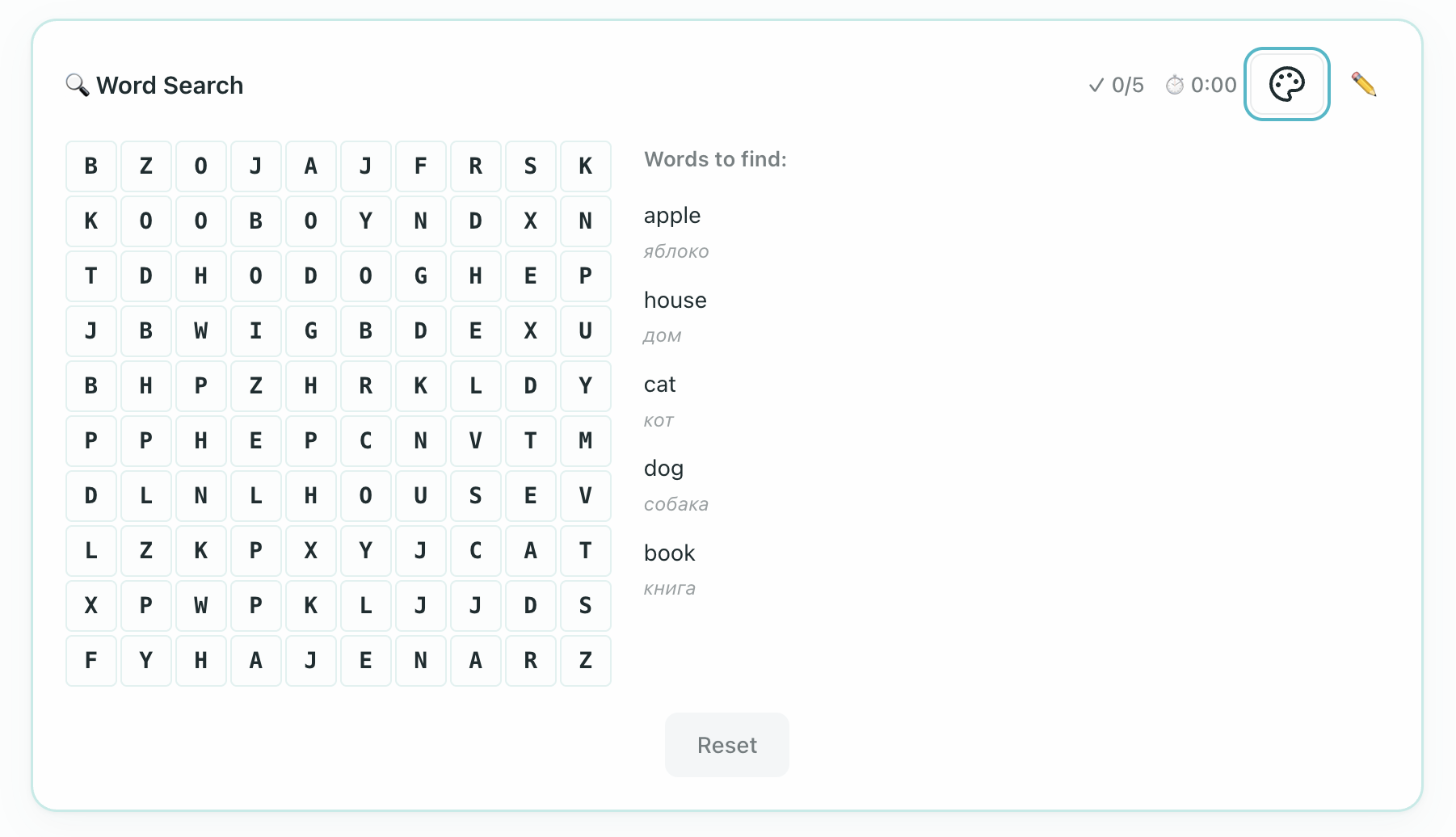
Students find hidden words in a letter grid.
Content Format
Each line: word (optional clue):
- apple (яблоко)
- house (дом)
- cat (кот)
Settings
| Parameter | Values | Default | Editable |
|---|---|---|---|
grid_size | number (6-15) | 10 | Yes |
directions | horizontal, vertical, diagonal (comma-separated) | horizontal,vertical | Yes |
instruction | any string | (none) | Yes |
show_word_list | true, false | true | Yes |
time_limit | seconds (0 = no limit) | 0 | Yes |
ui | classic, children | classic | Yes (theme toggle) |
When a time limit is set, a countdown is displayed instead of elapsed time. When time runs out, the puzzle is locked and a "Time's up!" screen shows how many words were found.
Crossword Widget
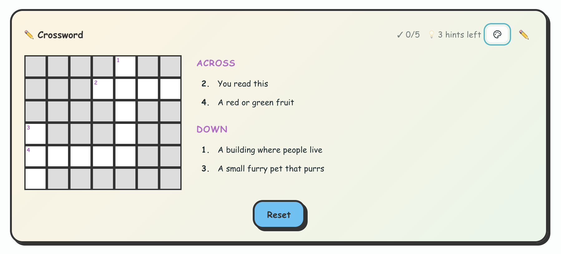
A classic crossword puzzle with clues.
Content Format
Each line: word : clue:
- apple : A red or green fruit
- cat : A small furry pet that purrs
- house : A building where people live
Settings
| Parameter | Values | Default | Editable |
|---|---|---|---|
hints_allowed | number (0-10) | 3 | Yes |
instruction | any string | (none) | Yes |
ui | classic, children | classic | Yes (theme toggle) |
Sentence Gap
A reading-coherence exercise available as a standalone Step kind in the Step Palette and an exam-style widget where students restore missing sentence fragments into numbered gaps in a passage.
Students place a fragment by tapping the gap and choosing from the list that opens, or by dragging a chip. In live sessions, the room broadcasts in real time what chip a participant is currently holding. Grading evaluates the text content of the chip rather than its internal identifier.
Content Format
The body has two parts separated by a line containing only ---.
:::sentenceGap(instruction="Complete the text with the missing fragments." distractors="1")
Remote work changed how many teams communicate. [1] Some people enjoy the flexibility. [2]
Other workers miss daily contact with colleagues. [3]
---
- Online meetings became part of everyday work.
- More companies now offer flexible schedules.
- This is why some offices use a hybrid model.
- Traditional offices are still common in banking.
:::
The numbered markers [1], [2], and [3] are the gaps in the passage. The tray lines are written in answer order: the first tray line is correct for [1], the second for [2], and so on. Extra lines after the real answers are distractors. The widget shuffles the tray for students.
Settings
| Parameter | Values | Default | Editable |
|---|---|---|---|
instruction | any string | (none) | Yes |
distractors | number | 0 | Yes |
ui | classic, children | classic | Yes |

Substitute Sentence
An exam-style passage widget for "choose the correct form in brackets" tasks. It wraps a full passage so examples and inline choices stay together.
Content Format
:::substituteSentence(instruction="Choose the correct form.")
<span class="exam-example">(**correct**, wrong1, wrong2)<sup>PRZYKŁAD</sup></span>
The graded item appears in the sentence as [correct, wrong1, wrong2].
:::
Inside the passage, square brackets create inline choices. The first option is the correct answer, followed by distractors. Exam presets usually generate this block for grammar tasks; teachers normally review it rather than writing it from scratch.

Callout Block (<note>)
A flexible, rich-content container block (<note>). Callouts highlight important concepts, explanations, or exam instructions with customizable visual backgrounds and styles.
Content Format
<note appearance="callout" background="blue" type="info" position="left" size="full">
Important rule, vocabulary spotlight, or cultural note goes here.
Callouts can hold multiple paragraphs, lists, and inline exercises.
</note>
Exam presets use grey exam notes (type="exam"):
<note appearance="callout" background="neutral" type="exam" position="left" size="mid">
PRZYKŁAD
Example text or answer bank goes here.
</note>
The editor also accepts style="exam" as an alias for type="exam". Callouts are visible to students. For teacher-only guidance, use an annotation block instead.
Settings and Attributes
| Attribute | Values | Default | Description |
|---|---|---|---|
appearance | callout | callout | Renders container with callout styling |
background | theme, neutral, blue, green, rose | theme | Background tint of the callout container |
type or style | info, warning, question, exam, children, quote | info | Semantic icon and styling preset |
position | left, centered, right | left | Alignment of the container on the page |
size | full, mid, small | full | Container width constraint |

Button Link Widget
A tactile, brand-styled interactive action button widget inserted via /button or toolbar.
Content Format
:::button(label="Open Course Materials" href="https://example.com/resources" variant="primary" target="_blank")
:::
Settings
| Parameter | Values | Default | Editable |
|---|---|---|---|
label | any text string | Button | Yes |
href | valid URL or internal platform path | # | Yes |
variant | primary, secondary, outline | primary | Yes |
target | _blank (new tab), _self (same tab) | _blank | Yes |
Buttons automatically adapt their styling to the active workspace brand palette and organic color theme.

Poll Widget
An interactive polling widget for classroom opinion gathering, pulse checks, and surveys.
Content Format
Options are listed below the opening fence. Prefix an option with * or [x] to denote preset selections if needed:
:::poll(instruction="Which topic would you like to review next?" mode="single" layout="vertical")
- Past perfect tense
- Phrasal verbs with 'get'
- Conditionals (2nd and 3rd)
- Idioms in business English
:::
Settings
| Parameter | Values | Default | Editable |
|---|---|---|---|
instruction | any text string | (none) | Yes |
mode | single (one choice), multiple (multi-select) | single | Yes |
layout | vertical, horizontal | vertical | Yes |
ui | classic, children | classic | Yes (theme toggle) |
During live sessions, votes synchronize across participants in real time.

Other Standalone Formats
AI Image Placeholder
An image request that the teacher or system can turn into a generated image:
![image:realistic "A family having dinner in a bright kitchen, natural light, no text"]()Settings: image type realistic or meme; the prompt must be inside quotes and the final parentheses stay empty until an image is generated.

Expandable Images Block
An interactive image gallery (/expandableimages or <expandable-images>) that displays a primary hero image with an expandable drawer for supplementary photos.
Content Format
<expandable-images hero="https://example.com/hero.jpg" alt="City square">
- https://example.com/statue.jpg (Town hall statue)
- https://example.com/cafe.jpg (Street cafe terrace)
- https://example.com/market.jpg (Morning flower market)
</expandable-images>
Settings
| Parameter | Values | Default | Description |
|---|---|---|---|
hero | image URL string | required | Primary image displayed before expansion |
alt | text string | (none) | Accessibility description for the hero image |
| body lines | - url (caption) | (none) | Supplementary images toggled by Show N more images |
Audio Player
Transcript text (shown after listening):
Optional transcript text hereSettings: src (audio URL), title (display title), transcript (hidden, after-listen, always), theme (default, compact), plays (maximum play count for exam tasks), and noRewind (true for no rewind).
AI Conversation Widget
An interactive scenario-based conversational role-play widget (/aiconversation or :::ai-conversation) where students engage in spoken dialogue with an AI conversational partner using push-to-talk voice turns.
Content Format
:::ai-conversation(role="customer" partner="barista" scenario="ordering-coffee" mode="voice")
**Scenario:** You are ordering coffee at a busy cafe in London.
**Your Goal:** Order a flat white with oat milk and ask about vegan pastries.
**AI Persona:** Friendly barista who asks for clarification on cup size.
:::
Settings
| Parameter | Values | Default | Editable |
|---|---|---|---|
role | role name (e.g. customer, traveler, job-applicant) | customer | Yes |
partner | conversational partner persona (e.g. barista, interviewer) | assistant | Yes |
scenario | scenario slug or title | (none) | Yes |
mode | voice (push-to-talk), text (typed turns), hybrid | voice | Yes |
instruction | header instruction string | (none) | Yes |

Speech Recorder
Reference text for the student to read aloud:
The quick brown fox jumps over the lazy dog.Settings: prompt (instruction text), maxDuration (seconds, default 60).
For exam speaking tasks, a speech recorder can be followed by automated assessment. The visible syntax is still :::speech(...); scoring is attached by the platform after the student's recording is submitted.
Pronunciation Assessment
Pronunciation drills use the course language automatically. Supported language codes are en, pl, de, fr, es, cs, it, pt, nl, sv, and lt. Put one target per line inside the fence:
:::pronunciation(language="en" difficulty="normal")
target="Hello"
target="Good morning"
target="How are you?"
:::
Settings:
| Parameter | Values | Default | Editable |
|---|---|---|---|
target lines | up to 10 slides; each target max 5 words / 60 chars | at least one target | Yes |
language | stored from the course language, such as en, pl, de, fr, es, cs, it, pt, nl, sv, or lt | course language | No |
difficulty | easy, normal, strict | normal | Yes |
Single-slide lessons may still store target="..." on the opening fence. Multi-slide drills use one target line per slide.
After a student records, Locuto adds playback and score details to the activity. Do not write [ref:…], [attempt:…], [url:…], or [score:…] markers by hand.

Live Examiner
The live examiner widget is used for exam role-play conversations. The body is the role card shown to the student before they start the conversation.
:::live-examiner(task="b1-nawa-speaking-rola" maxDuration=180)
**Situation:** You want to book a table in a cafe for Saturday evening.

**Your role:** You are the customer calling the cafe.

**You should:**
- give the day, time, and number of people,
- ask for a table by the window,
- ask about a birthday cake.
:::
Settings:
| Parameter | Values | Default | Editable |
|---|---|---|---|
task | b1-nawa-speaking-rola | b1-nawa-speaking-rola | Usually generated by the exam preset |
maxDuration | seconds | 180 | Usually generated by the exam preset |
Runtime may attach [recording:…] to reconnect a scoring attempt after refresh. Do not write that marker by hand.

Writing Widget
The Writing widget is different from the older open-ended Essay block. It is used for structured exam writing tasks with word ranges, text entry, optional handwriting upload, and automated rubric feedback.
:::writing(set_id="1")
- part(id="p1" subtype="announcement" min=25 max=50 allow_text=true allow_image=true max_images=3)
  Write a short announcement for a language-school notice board.
- part(id="p2" subtype="email" min=160 max=175 allow_text=true allow_image=true max_images=3)
  Write an email to a friend about how you are improving your health this year.
:::
Settings:
| Parameter | Values | Default | Editable |
|---|---|---|---|
set_id | number or numeric string | 0 | Usually generated by the exam preset |
id | part id, such as p1 or p2 | required | Usually generated by the exam preset |
subtype | announcement, invitation, postcard, well-wish, essay, narrative, email, character-description, report | required | Yes |
min / max | target word range | required | Yes |
allow_text | true, false | true | Yes |
allow_image | true, false | true | Yes |
max_images | number | 3 | Yes |

Essay Block
Sentence starter text:
In today's world...
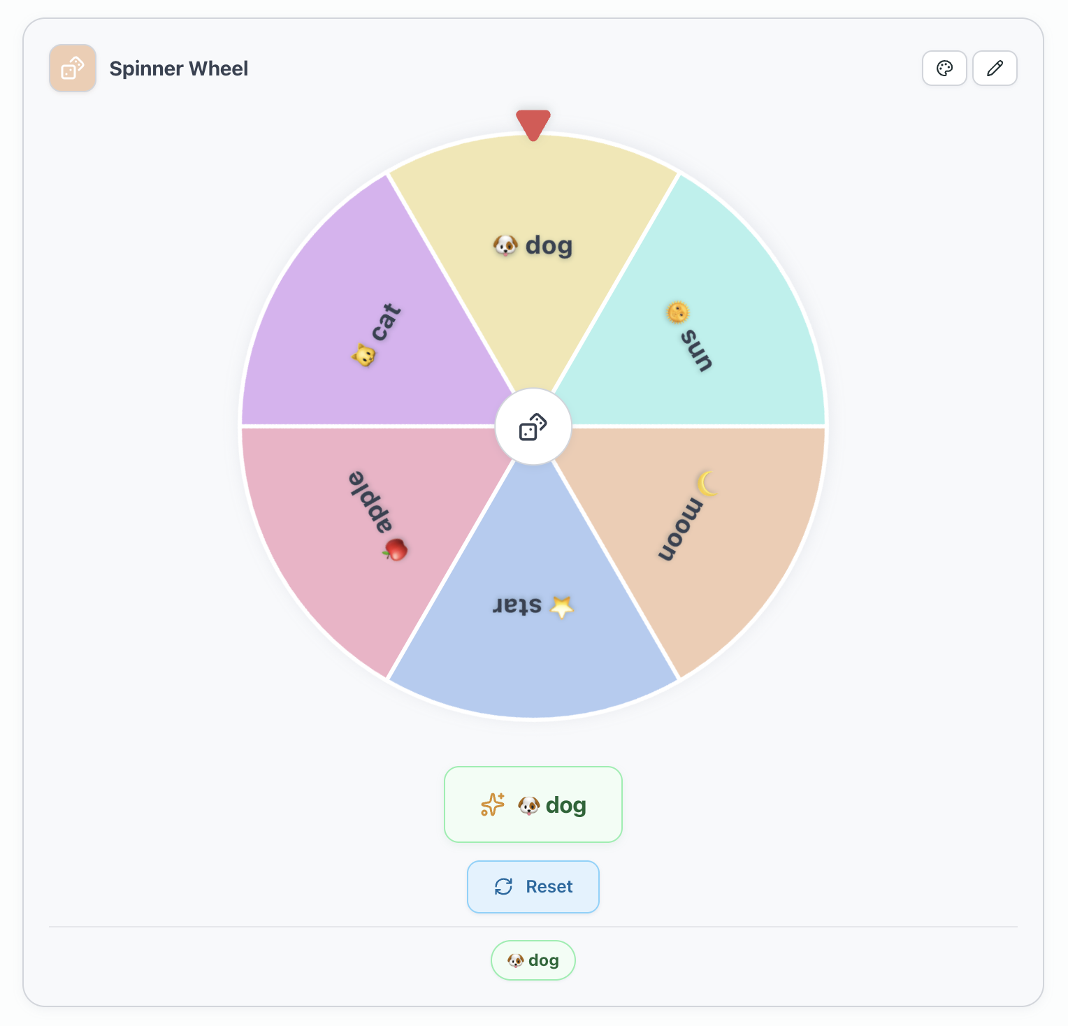
Roulette Wheel Widget
An interactive spinning wheel widget (/roulette or :::roulette) for random prompts, student turns, or speaking warm-ups.
Content Format
:::roulette(instruction="Spin the wheel for a conversation prompt" theme="forest")
- Tell us about your favorite holiday
- What is your dream job?
- Describe your morning routine
- If you could travel anywhere, where would you go?
:::
Settings
| Parameter | Values | Default | Editable |
|---|---|---|---|
instruction | any text string | (none) | Yes |
theme | any of the 21 supported themes (including modern) | forest | Yes |
Drawing Board Widget
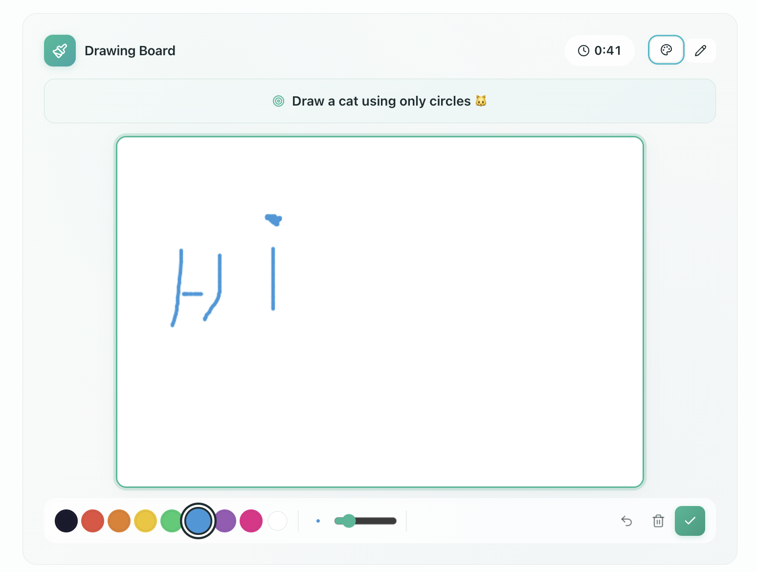
A collaborative, timed sketching canvas (/drawingboard or :::drawing-board) designed for brain breaks and energizer games.
Content Format
:::drawing-board(instruction="Draw a cat using only circles" duration=60 theme="forest")
:::
Settings
| Parameter | Values | Default | Editable |
|---|---|---|---|
instruction | sketching prompt or challenge | (none) | Yes |
duration | countdown timer in seconds (optional) | 60 | Yes |
theme | any of the 21 supported themes (including modern) | forest | Yes |
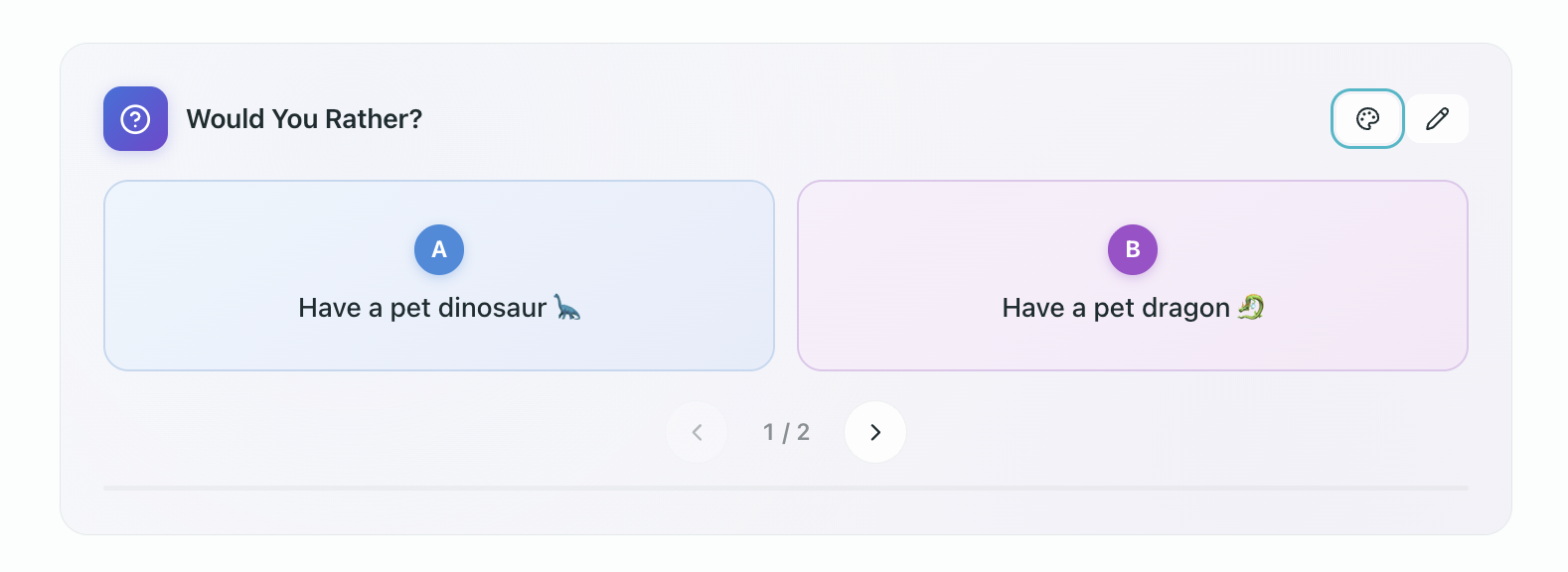
Would You Rather Widget
A light discussion and warm-up widget (/wouldyourather or :::would-you-rather) presenting two contrasting choices per round.
Content Format
Each line inside the fence defines two options separated by a pipe (|):
:::would-you-rather(instruction="Choose your preference and explain your reasoning" theme="forest")
Have a pet dinosaur | Have a pet dragon
Be invisible | Be able to fly
Live in the mountains | Live by the ocean
:::
Settings
| Parameter | Values | Default | Editable |
|---|---|---|---|
instruction | header prompt text | (none) | Yes |
theme | any of the 21 supported themes (including modern) | forest | Yes |
Breathing Timer Widget
A guided mindfulness and pacing widget (/breathingtimer or :::breathing-timer) for short focus breaks between intense lesson activities.
Content Format
:::breathing-timer(instruction="Take a deep breath" duration=60 pattern="4-4-4-4" theme="forest")
:::
Settings
| Parameter | Values | Default | Editable |
|---|---|---|---|
instruction | header text string | (none) | Yes |
duration | exercise duration in seconds | 60 | Yes |
pattern | breathing rhythm interval (4-4-4-4 box breathing, 4-7-8 relaxation) | 4-4-4-4 | Yes |
theme | any of the 21 supported themes (including modern) | forest | Yes |

Kids Equation Widget
A visual arithmetic widget (/kidsequation or :::kids-equation) for elementary math practice where students fill in missing numbers or operator symbols.
Content Format
:::kids-equation(instruction="Complete the addition problem" theme="forest")
3 + ___(5) = 8
___(4) + 6 = 10
:::
Settings
| Parameter | Values | Default | Editable |
|---|---|---|---|
instruction | any text string | (none) | Yes |
theme | any of the 21 supported themes (including modern) | forest | Yes |

Picture Word Gaps Widget
A visual exercise widget (/picturewordgaps or :::picture-word-gaps) displaying picture cards alongside text where students fill in missing letters or vocabulary words, or label entire pictures.
Content Format
Standard Gap-Fill Mode (taskMode="gap-fill"):
:::picture-word-gaps(instruction="Look at the pictures and fill in the missing letters" theme="studio")
- [https://example.com/apple.jpg] a___(pp)le
- [https://example.com/banana.jpg] b___(ana)na
- [https://example.com/cherry.jpg] ch___(err)y
:::
Whole-Picture Label Mode (taskMode="picture-labels"):
:::picture-word-gaps(instruction="Label the pictures" taskMode="picture-labels" cardSize="auto" theme="modern")
- [https://example.com/solar-system.jpg] Solar System
- [https://example.com/telescope.jpg] Optical Telescope
:::
In whole-picture label mode, students can label up to 24 pictures with multi-word phrases (up to 160 characters per label). An image zoom/enlarge button appears on each card, with instant grading as tiles are dropped into slots. The draggable tile tray remains pinned to the bottom of the screen while scrolling.
Settings
| Parameter | Values | Default | Editable |
|---|---|---|---|
instruction | any text string | (none) | Yes |
taskMode | gap-fill (missing letters), picture-labels (whole picture labels) | gap-fill | Yes |
cardSize | auto (compact for 3+, large for 1-2), large, compact | auto | Yes |
theme | any of the 21 supported themes (including modern) | studio | Yes |
shuffle | true, false | true | Yes |

Teaching Clock Widget
An interactive analog and digital time-telling widget (/teachingclock or :::teaching-clock) where students drag clock hands to set a target time or practice reading clock faces.
Content Format
:::teaching-clock(instruction="Show half past three on the clock" time="03:30" mode="interactive" showDigital=true theme="studio")
:::
Settings
| Parameter | Values | Default | Editable |
|---|---|---|---|
instruction | prompt or target instruction | (none) | Yes |
time | time in HH:MM format (for example, 03:30, 14:15) | 12:00 | Yes |
mode | interactive (student drags hands), display (read-only demonstration) | interactive | Yes |
showDigital | true, false (display digital time readout below clock) | true | Yes |
theme | any of the 21 supported themes (including modern) | studio | Yes |

Handwriting Check Widget
An assessment widget (/handwriting or :::handwriting-check) where students upload photos of handwritten work for teacher review, annotation marks, and drawing feedback.
Content Format
:::handwriting-check(instruction="Upload photos of your handwritten essay" maxImages=5 categories="spelling,grammar,punctuation,word_choice,other")
:::
Settings
| Parameter | Values | Default | Editable |
|---|---|---|---|
instruction | instruction string shown to the student | (none) | Yes |
maxImages | number of allowed photo uploads (1–10) | 5 | Yes |
categories | comma-separated mistake types (spelling, grammar, punctuation, word_choice, other) | all categories | Yes |
Under Exam Lockdown, submissions are locked once submitted or when the exam timer expires.

Individual Work Block
A teacher-controlled container block (<individual-work>) that wraps a task template (<task>) and provides each student with an isolated workspace during live classes, homework, or self-study.
Content Format
<individual-work>
<task>
Write three sentences describing your morning routine:

1. ___(First, I wake up at 7:00.)
2. ___(Then, I have breakfast.)
3. ___(Finally, I leave for work.)
</task>
</individual-work>
Structure and Behavior
| Tag | Role | Description |
|---|---|---|
<individual-work> | Root container | Staff-only wrapper block managing student state and permissions |
<task> | Task template | Contains the original exercise blocks, text, or instructions copied to students |
In live group classes, the block displays a Start button, student switcher with live progress counters, private Peek mode, and a Show to class spotlight. In homework, self-study, and 1:1 lessons, individual copies are instantiated automatically.

Annotation (Teacher-Only)
Teaching notes visible only to the teacher:
Remind students about the irregular verb patterns from last lesson.
Exercise Container
Exercise content with answer fields and dropdown answers inside. The exercise block groups multiple questions with a shared title and scoring.
Custom Points Attribute
The points="N" attribute specifies a custom total point value for the entire exercise container:
<exercise points="10" title="Vocabulary Practice">
1. She ___(went) to the store yesterday.
2. They ___(visited) their friends last week.
</exercise>
Or in fence syntax:
:::exercise(points="10" title="Vocabulary Practice")
1. She ___(went) to the store yesterday.
2. They ___(visited) their friends last week.
:::
When points="N" is provided, the grading engine proportionally scales the score of each individual question item so that completing all answers correctly totals N points. Without the attribute, the widget defaults to awarding 1 point per question.
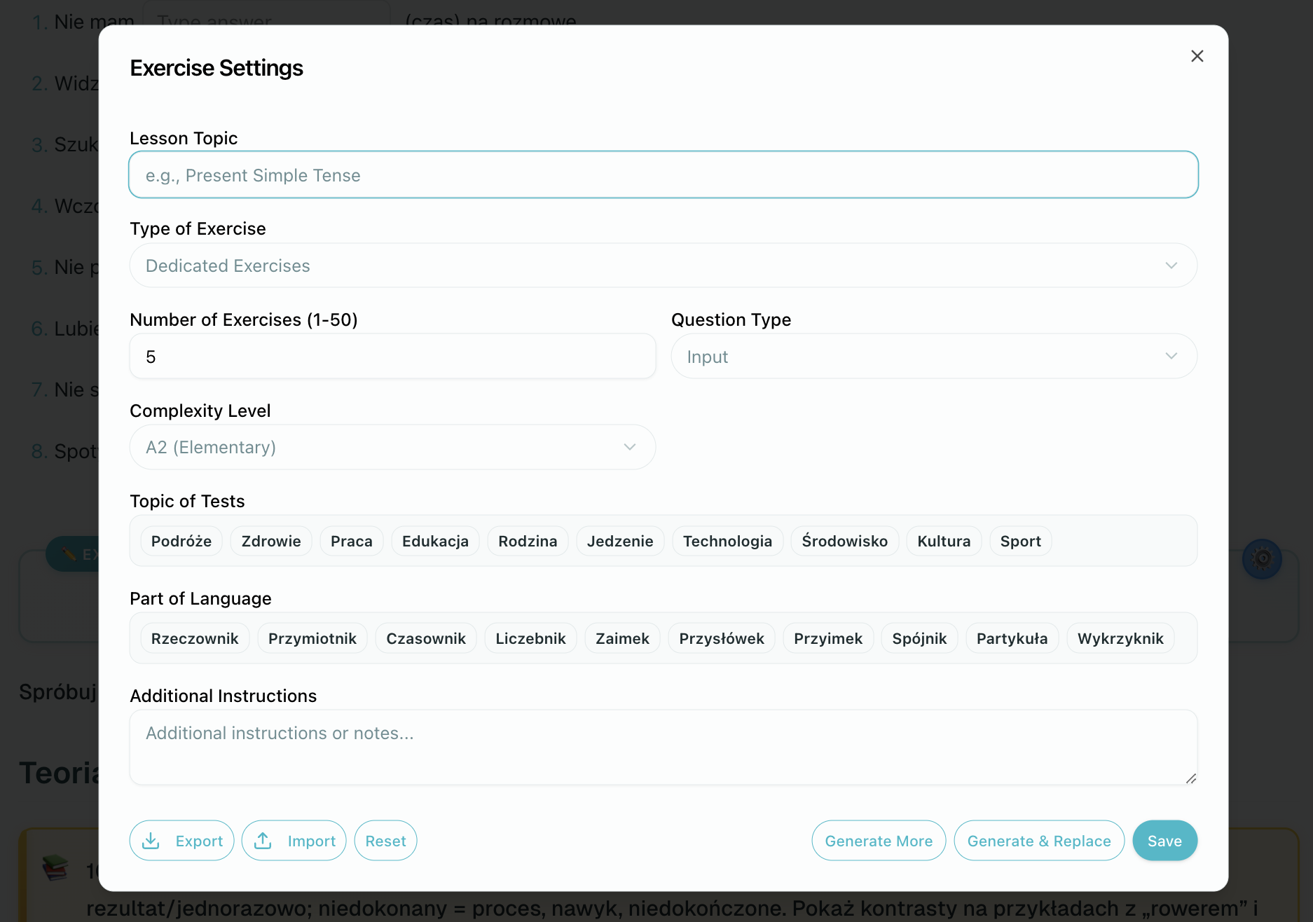
Table with Fill-in Cells
Standard tables can include ___() format inside cells:
| Form | "go" | "be" |
|------|------|------|
| Present | ___(go) | ___(am) |
| Past | ___(went) | ___(was) |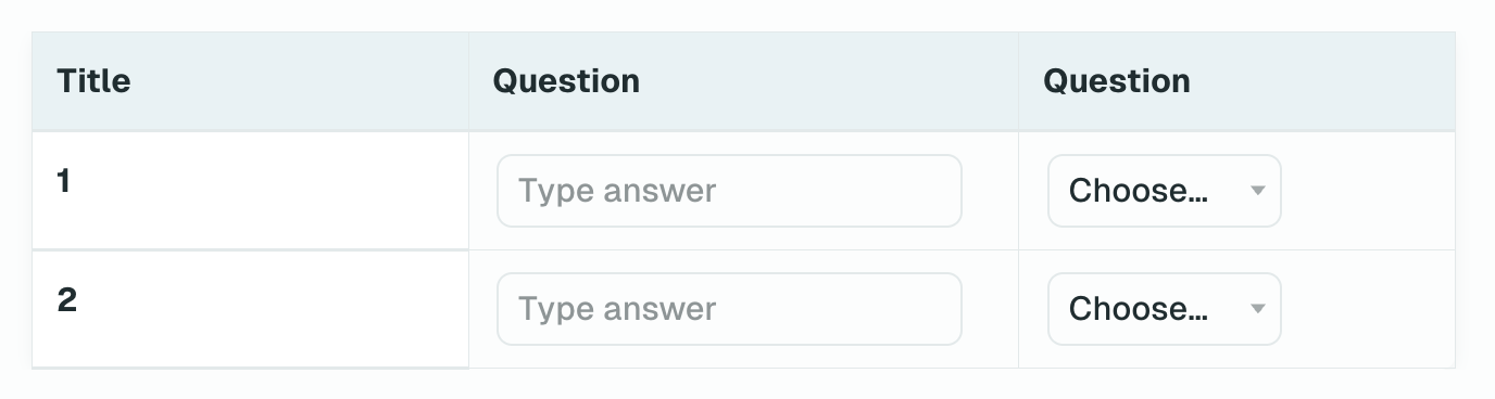
Word List (Vocabulary)
A dedicated vocabulary widget (/wordlist or :::word-list) presenting terms, phonetic transcriptions, translations/definitions, and example sentences with student bookmarking and zero-cost native audio pronunciation.
Content Format
:::word-list(instruction="Key Vocabulary" lang="en")
- ubiquitous | present or found everywhere (ipa: juːˈbɪk.wɪ.təs) (ex: Smartphones are ubiquitous.)
- leverage | use something to maximum advantage (ipa: ˈliː.vɚ.ɪdʒ) (ex: We should leverage our strengths.)
- resilient | able to recover quickly (ipa: rɪˈzɪl.jənt)
:::
Syntax Rules & Item Grammar
- Term and Meaning: Written as
- term | meaningon each line. - IPA Transcription: Optional phonetic guide specified in parentheses with
(ipa: ...). - Example Sentence: Optional context sentence specified in parentheses with
(ex: ...). - Image: Optional illustration URL attached via standard markdown
. - Settings:
instruction: Header instruction string shown above the list.lang: Language code (e.g.en,de,es,pl). Defaults to the course language.
Free Pronunciation Audio: Audio playback for words in the Word List widget is served from the global platform word store. Pronunciation generation is 100% free (0 AI credits deducted). When a teacher saves a lesson, the platform automatically pre-warms pronunciation audio in the background.

Answer Notes Rule
The matching, ordering, sentence builder, true/false, choose answers, and category sort widgets already encode correct answers in their content format. If you need a teacher-only answer key or explanation summary after these widgets, wrap it in an annotation. For inline answer widgets, use <<comment>> only when the explanation should eventually be shown to students after the answer reveal.
Frequently Asked Questions
Do I need to write this syntax by hand?
No. The editor generates the correct format when you use the toolbar or slash commands. This reference is for advanced users, troubleshooting, and understanding how AI-generated content works.
What happens if the format has an error?
The system checks the widget format during save. Incorrectly formatted content may be displayed as plain text or trigger a warning in the editor.
Can I copy and paste widget content?
Yes. You can copy widget content from one lesson and paste it into another. The editor will read and display it correctly.
How does the AI lesson builder use this format?
The AI generates lesson content including widget data. The system then converts the text into editor content blocks. Understanding the content format helps you read and modify AI-generated content.